Scroll & Read More

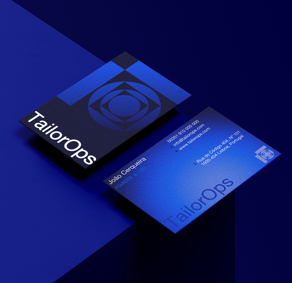
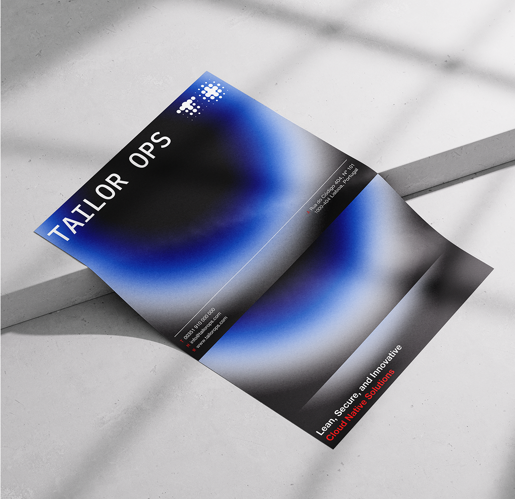
As a freelance lead designer, I was tasked with developing the complete visual identity for this newly established brand. This involved creating a cohesive and compelling design system that included the logo, color palette, typography, brand mockups, and a suite of social media templates. My goal was to establish a distinctive and versatile visual language that could scale across various platforms and communicate the brand’s values effectively.
To guide the creative process and align with the client’s vision, I developed and presented three distinct design directions—each with its own unique conceptual foundation and aesthetic. These options provided the client with a clear sense of how the brand could be visually expressed, ultimately helping them choose a direction that best aligned with their goals and target audience.
A key challenge was crafting a strong visual direction that effectively communicated an abstract concept—conveying both innovative tech solutions and a sense of trust—through a strategically designed visual approach.